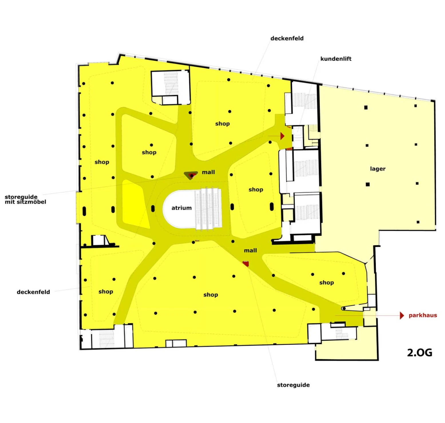
The layout of the store was not intuitive. Walkways were complex and confusing, and it was difficult to navigate. To improve this, the layout of the indoor levels (G, 1st, 2nd, and 5th) has been entirely re-designed and smaller retail spaces have been added. The key to designing the individual levels was to think “empty” in order to enable the future implementation of an improved orientation system.
The preconditions for this complex undertaking were: For each rental space, a newer space of equal size but higher quality had to be provided. Each tenant had to be relocated twice during the construction time. The ongoing daily shopping activity should be only minimally disturbed.

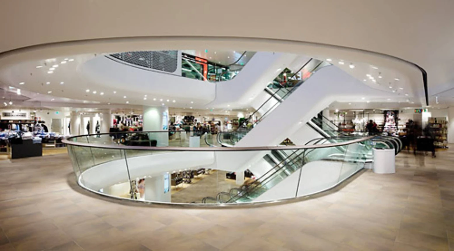
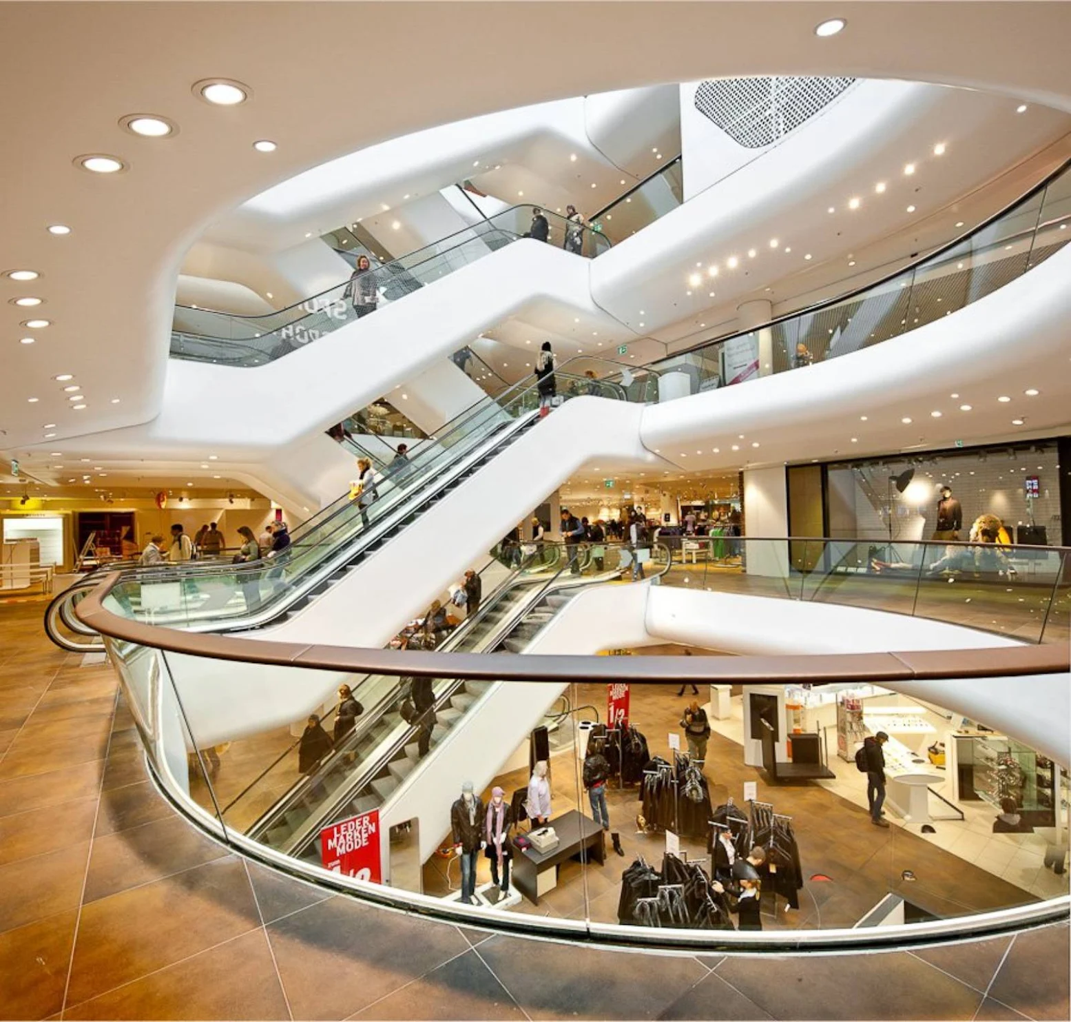
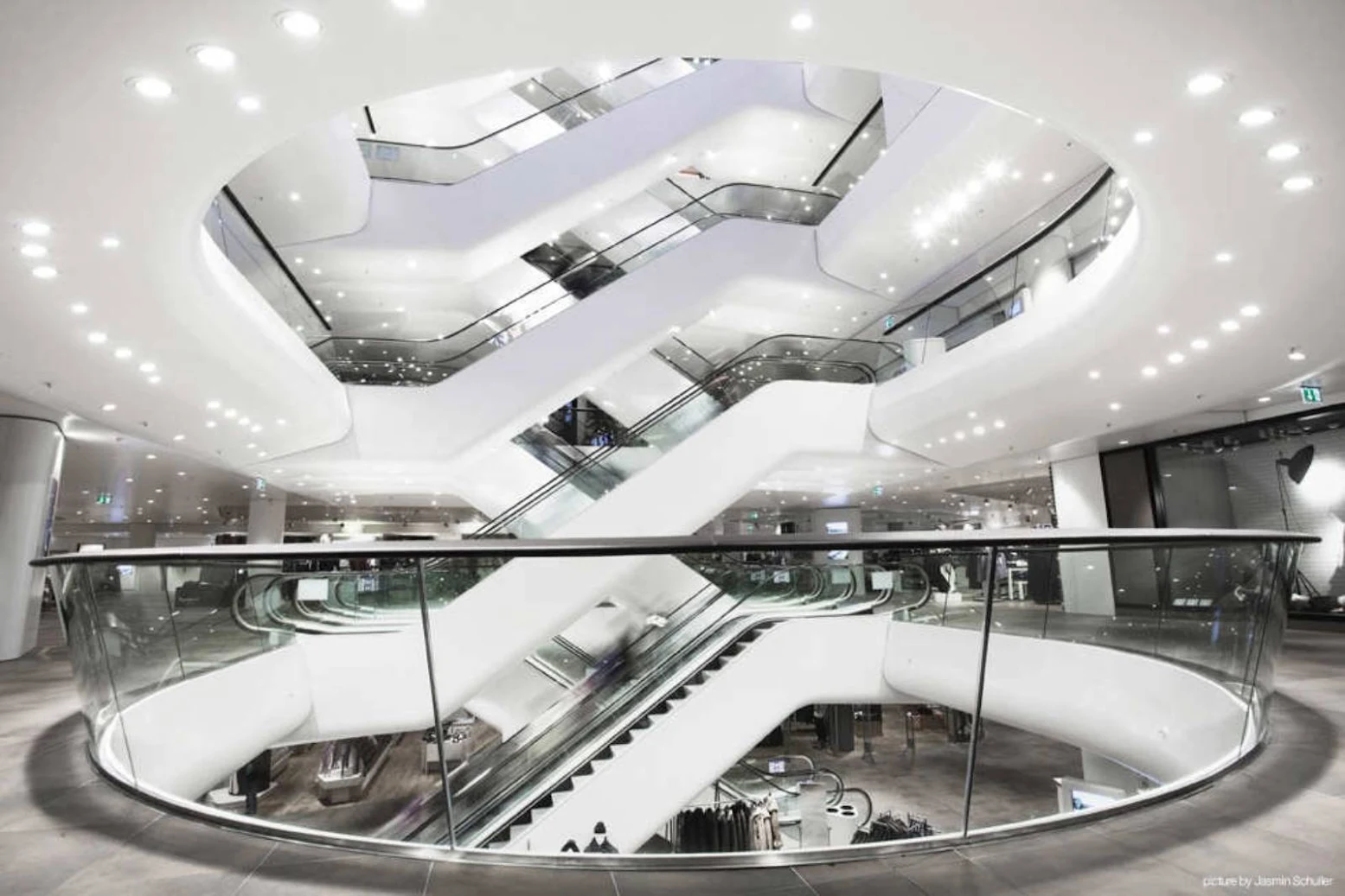
Create a new Centre!: To this end, the atrium, with its escalator network, took centre stage. The atrium serves as the nucleus and has become the store’s central orientation point.

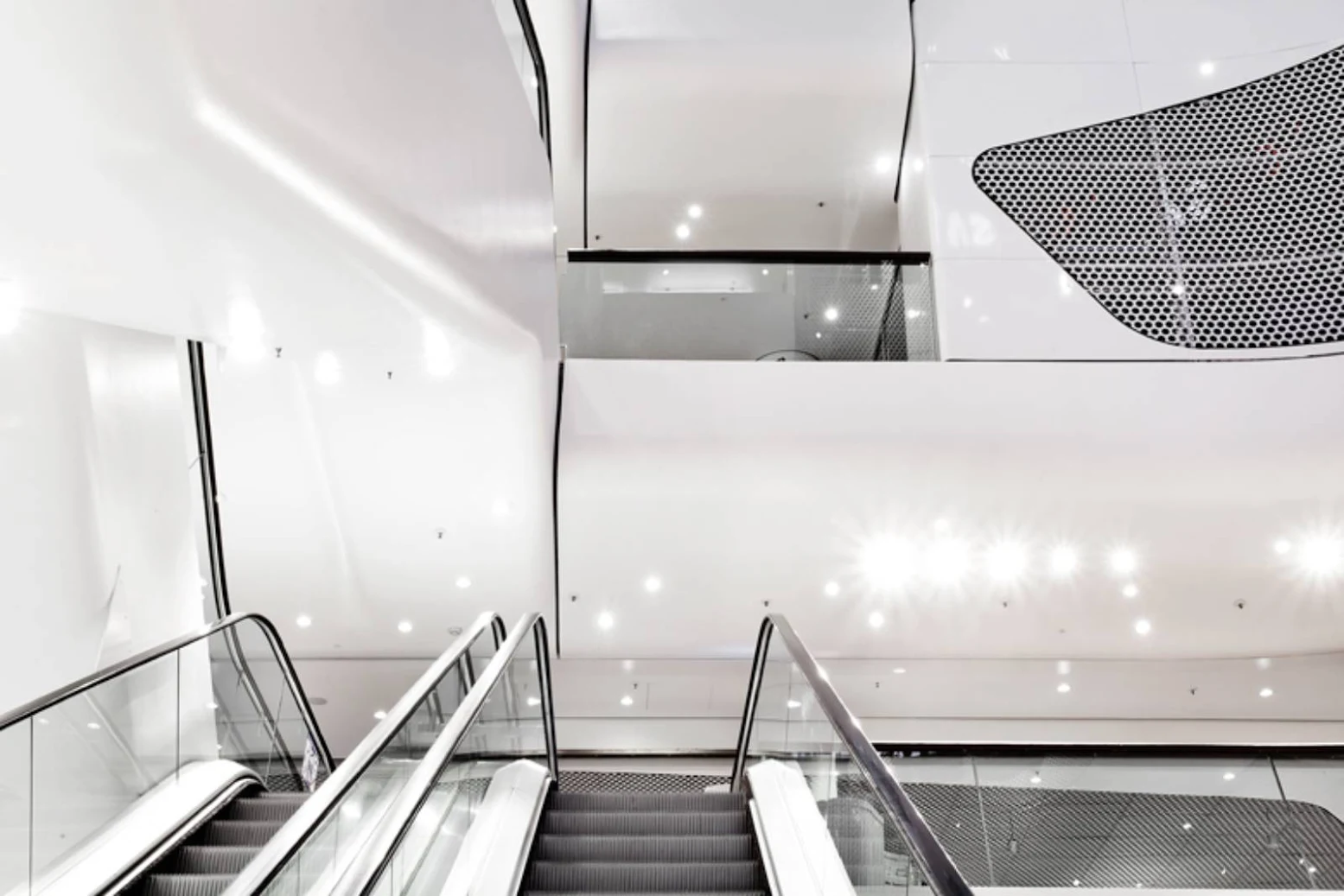
The Atrium - a sweeping upward perspective: The atrium, which unites the horizontal and vertical visual axes, has becomes the store’s new nucleus and central orientation point. The ceilings of the individual levels are rounded and “rolled” upwards. In this way, the atrium expands up towards the retail levels, appearing larger and more open than the atrium in its previous incarnation. The atrium and retail areas seem to melt together, bringing the individual levels into a mutual dialogue and making the store into a special continuum.
This effect is supported by the lighting and materials strategy: Both the materials and the manner of material transitions within the individual levels are also present in the atrium (large perforated metal areas appear as if emerging from a white foundation). The light fixtures, placed freely on the ceilings of each level, cover the rounded bends of the atrium and the escalators, until they are transformed into light points vertically set in the perpendicular cladding of the central room. Overall, the atrium appears light and dynamic – the relatively short individual storeys now appear lofty.
The Interior: The retail areas of the new store are distributed like ice floes on each story. These floes are marked by a change in floor covering and ceiling material, thereby forming a star-shaped pattern of paths on both the ceiling and the floor. In this way, the materials on the floor and ceiling facilitate orientation within the building. Paths and retail areas are explicitly marked and visible from afar: Large perforated metal areas in the ceiling demarcate the retail areas.
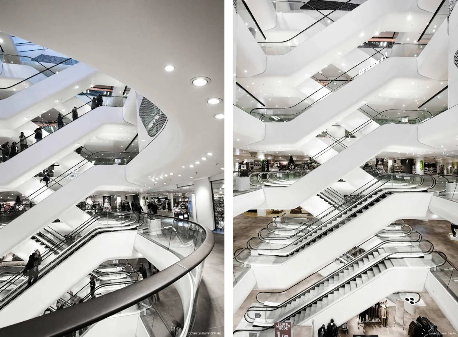
These areas form a multifunctional, highly flexible ceiling system and house the primary technical installations, security technology and product lighting. In contrast, the network of paths is mirrored with a high-quality plasterboard ceiling. Both ceiling concepts flow in rounded edges up over the entire atrium. Together with the escalator panelling, this creates a unified effect that stretches across the entire interior of the Gerngross department store. The interior is then expanded through resting station, sitting lounges and temporary displays.
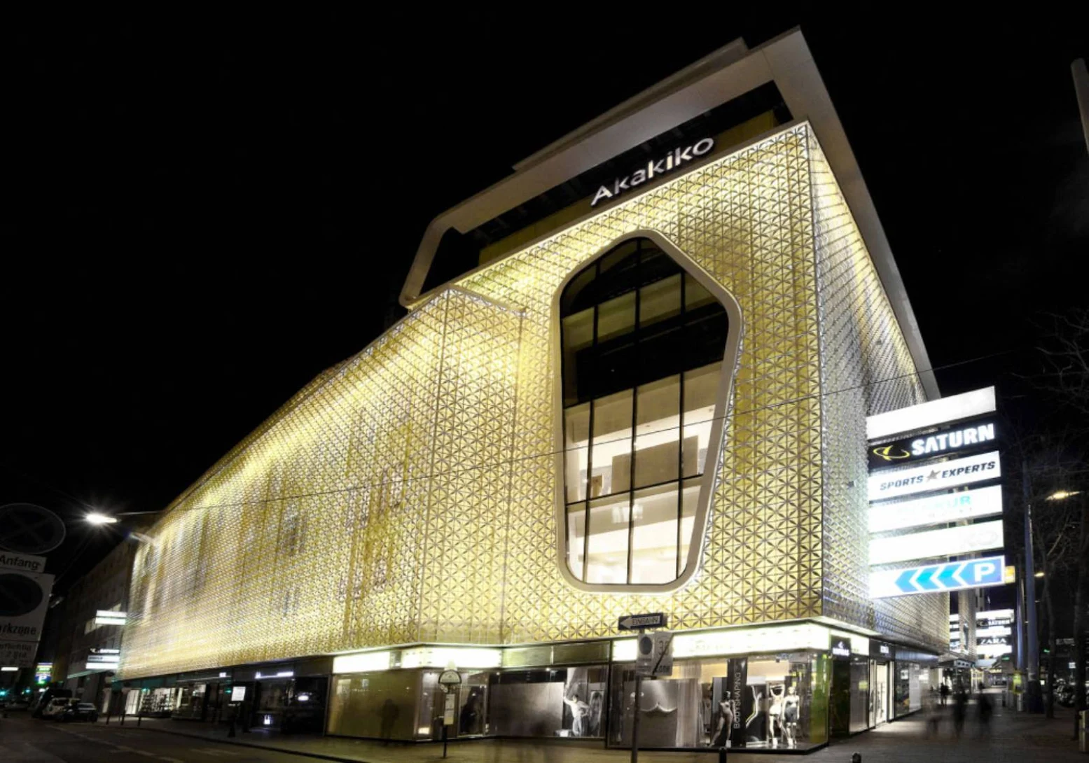
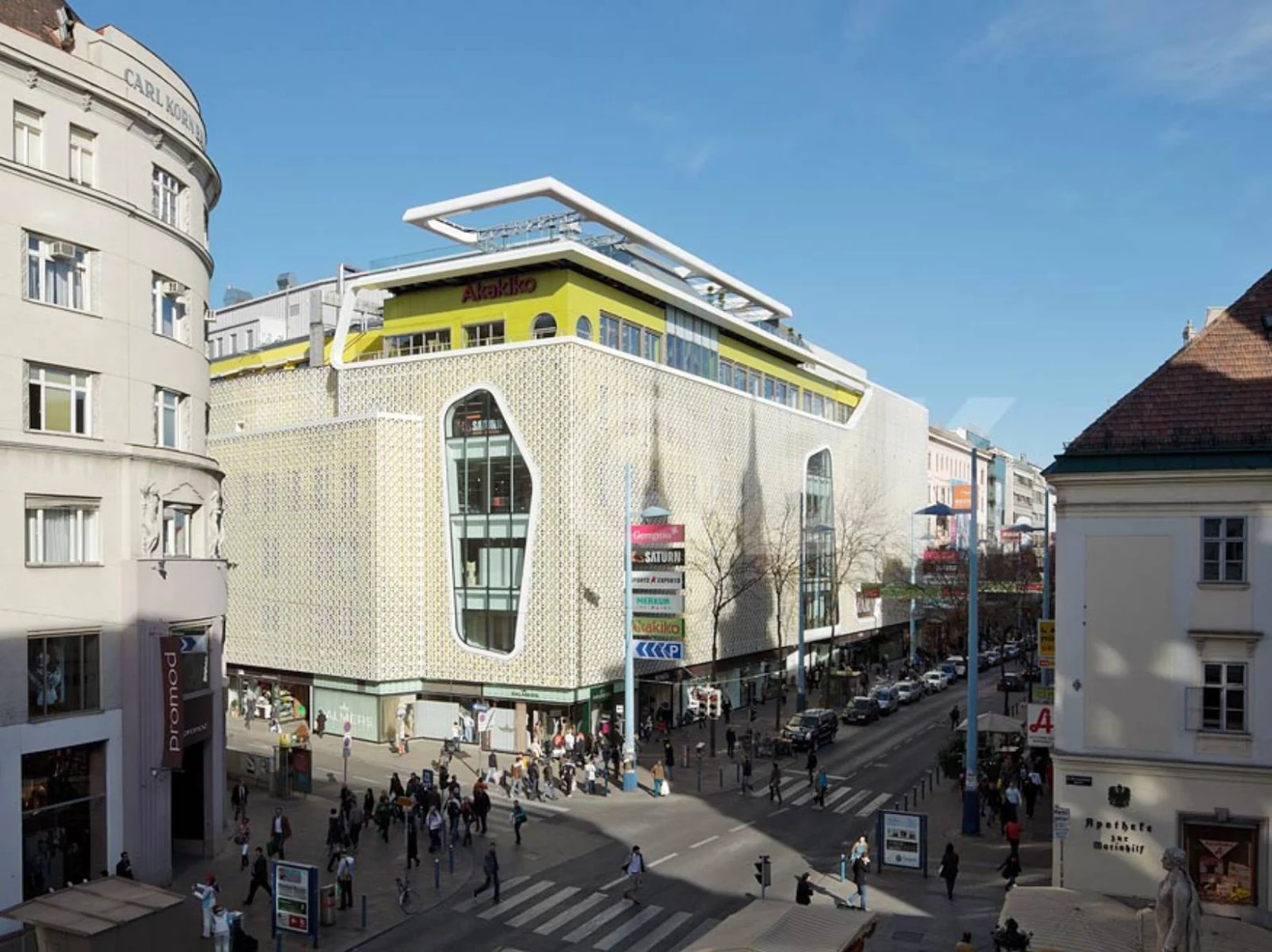
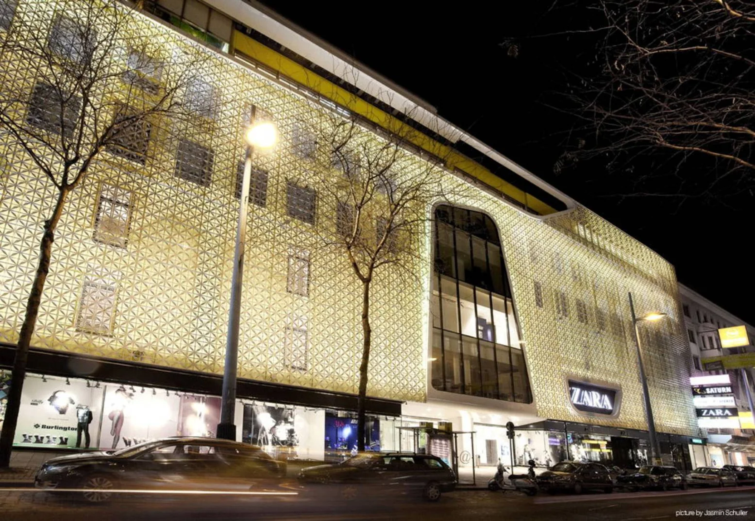
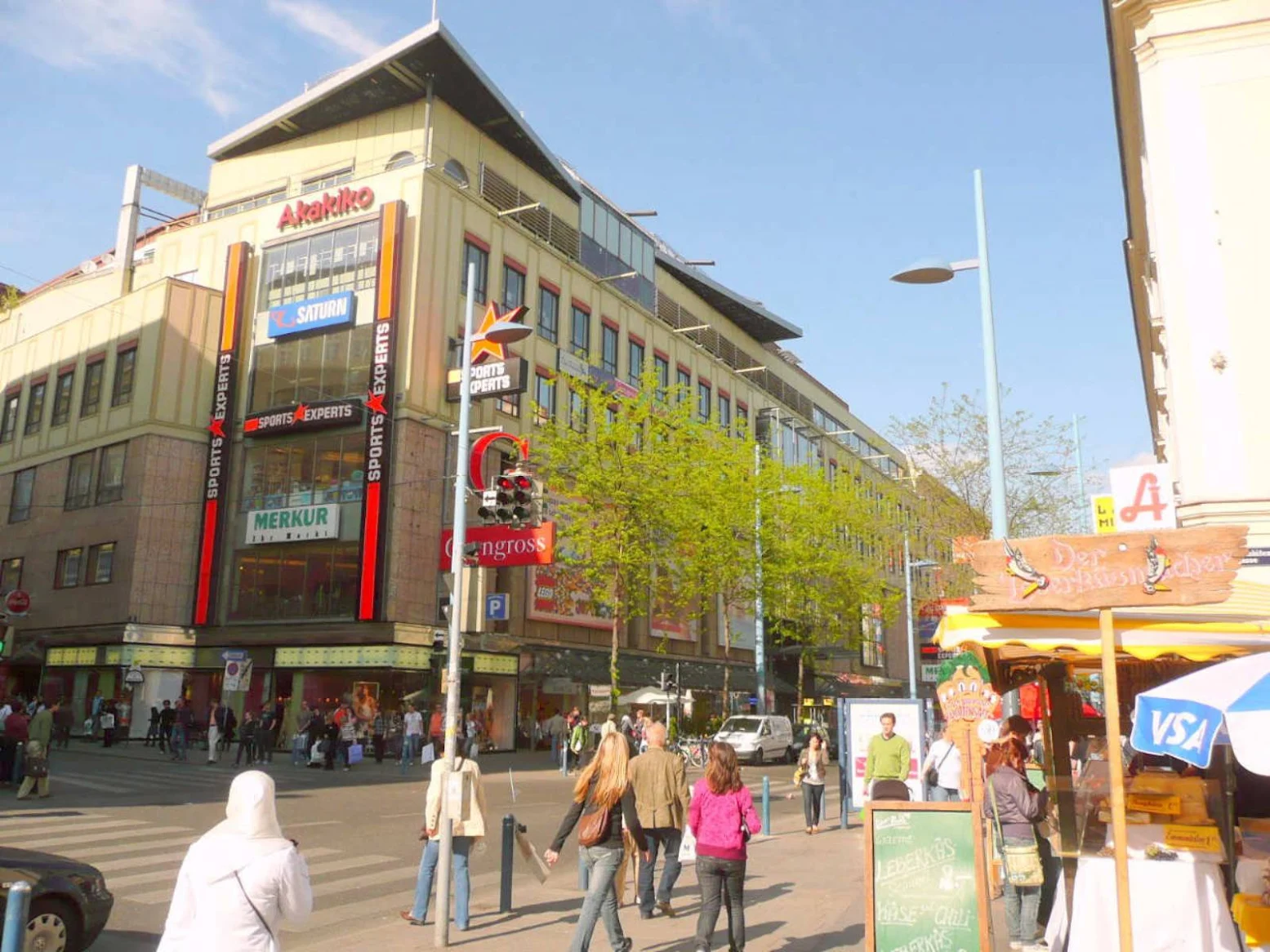
The Gerngross Façade: The façade of the new building forms the logical continuation of the interior: the ice-floe theme of the interior space continues on the new façade. To this end, large-scale, amorphous colour fields were applied. Leaving some space in between, an ornamentally designed, semi-transparent white area was then attached. Together, these layers form a conglomerate of light and colour. In the evening, this effect is reinforced by a lighting concept between the two layers of the façade.
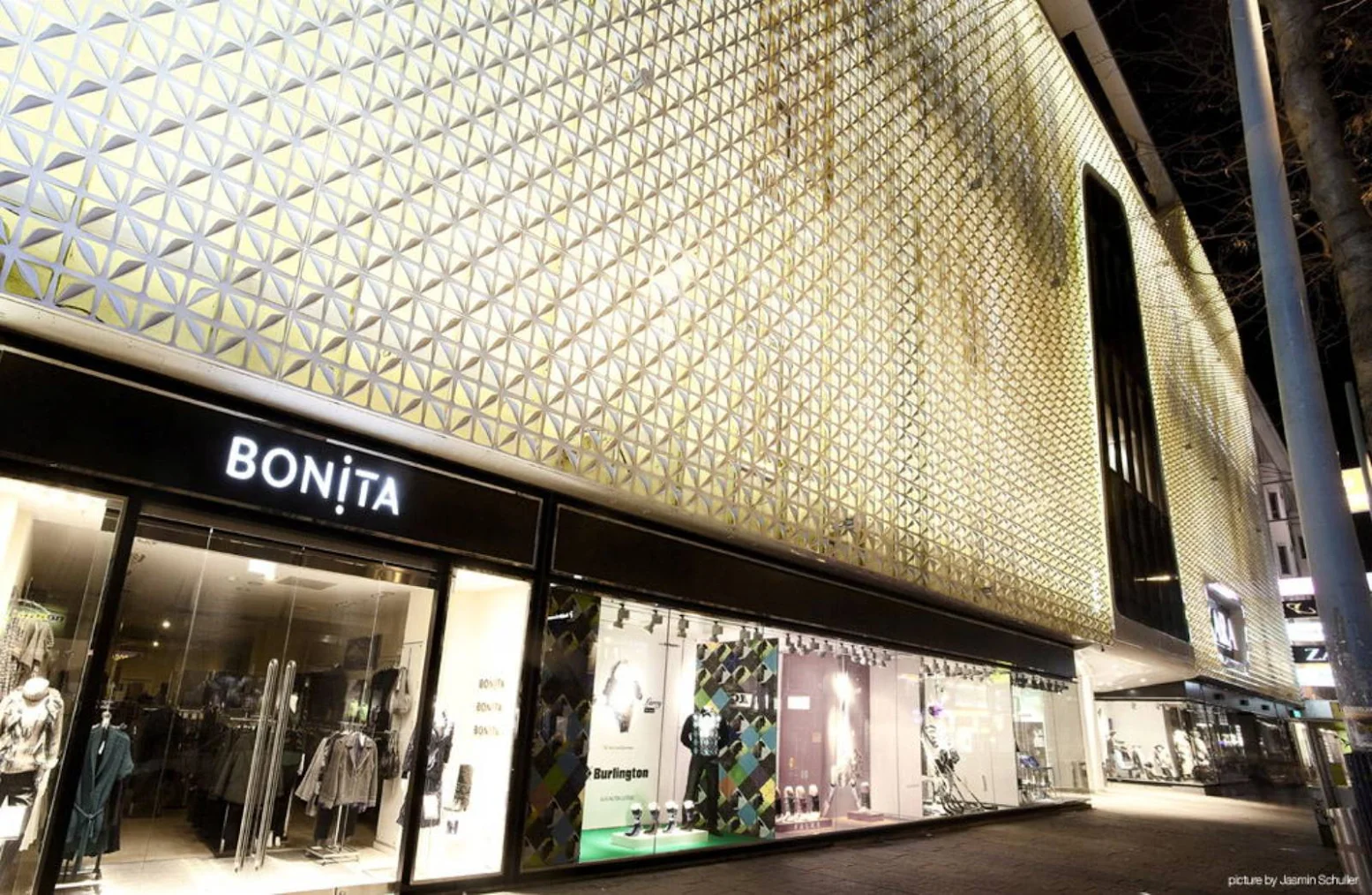
A large-scale white frame also emphasises some areas of the façade (e.g. main entrance, bay), thereby showing them off to their best possible advantage. Due to the large scale of the façade, the entire building is harmonized, and the true size of the building is emphasised. Advertising media, such as logos and slide-in plates, have been aggregated and drastically reduced as compared to their former state. The ornamental pattern was designed to ensure a continuous view from the building into the street space (50% free cross-section). Furthermore, the entire façade was thermally reengineered and technically modernised, so the ornamental pattern functions simultaneously as sun protection.

The "Tilting Effect": Depending on where they stand, viewers perceive the façade differently: From a level viewing angle, it appears more like a white-ornamental field. As the viewing angle gets steeper, the background colour of the house comes more strongly into focus. This creates a tilting effect, which follows the passers-by.


Location: Vienna, Austria Architect: LOVEarchitecture and urbanism Project Team: Andreas Perchinig, Sigrid Derler, Sabine Sternbach, Uwe Unterberger Contractor: Leyrer & Graf Size: 52.500 m2 Year: 2010 Cost: 40 Million € Client: Deka Immobilien Investment GmbH